Monday, November 29, 2010

The color of Facebook.

Imagine, the color blue then think of the Internet and the Social Network. What are you thinking of? Facebook. Am I right?

imagesource: appadvice.com
We tend to recall on things that we are familiar with. Blue is the color of the design on the Facebook social network site and us bloggers are always on the Internet. However, because everyone has his or her own perception on color, the type of blue varies, as Albers states in his book ‘Interaction of Color’. Even though the color and logo is prominent in society, we don’t know exactly what blue it is. The designer knows the color number, but the commoners don’t.
Our human retina receives the 3 primary colors, blue, red, and yellow. These three primary colors constitute all color. With the Facebook logo being blue, the eye cannot be deceived. It is blue. This blue offers a commonality to receivers. MySpace, an earlier social network site was blue. Facebook used this idea, and incorporated to their color design. The simplicity of the color used allows receivers not to be overwhelmed with the blue logo. When the screen is lit, you still want to stare at it, compared to an orange sign when it’s lit up you tend to squint or look the other way.
It takes a long process to determine the color of a logo, emblem, or design. Everything goes back to Zeitgeist, which is the spirit of the times. Color popularity changes season to season. As we get older, we see the world differently. Color may help designs out because it becomes extra visual aid for the eye, but Facebook creator, Mark Zuckerberg is colorblind. He cannot see the color of his logo, yet the logo is known throughout the world. Despite how color can transform a design, it might not matter too much; we did live in world of black and white.

“Can we pretend that airplanes in the night sky are like shooting stars? "

....I could really use a wish right now.
imagesouce: gtsaviation.com
Airplanes are utopia. It helps improve this society in many ways possible. It changed the game for transportation. You can travel from one location to the next in less time it would take to walk.
Because we humans live in a face-paced environment, we want to do things quick, easy, and efficient. And if we are in a rush and cannot waste time, we want what’s the best for us. Airplanes apply to every said above. Without it, we would not live in a utopian lifestyle. There would be less jobs for people because their would be no airports, businesses will suffer because they won’t be able to ship produces in a timely manner, and we would be impatient of each other and life, causing everyone to kill one another (maybe).
The design of an airplane strives to improve society because it can hold numerous amounts of passengers, weights, and baggage to those want to travel. Everyone would not have to take boats anymore to reach from continent to the next. It changed the course of time. It allows society to see the world in less time it would take those who lived in the Ice Age.
The design of airplanes also differs from other transportation that is currently produced. It has symmetrical wings, generating aerodynamics force lifting the object into the sky. Unlike cars, subways, buses, and bikes, airplanes fly in the sky. There is no traffic in the sky and pilots are able to fly more often because there is not much in the sky to compete with.
We could only wish to time travel every time we see a shooting star (or an airplane), but the closest thing to time traveling is flying on an airplane. It’s fast, efficient, and here to use. Society has taken advantage of it and has not stopped despite the pat downs in airport security. If it makes us happy, it stays.

I'll catch a grenade for you.

With Bruno Mars’s hit single “Grenade” out on the radio, I come to ponder “will someone really catch a grenade of their significant other?” I may not be the romantic, but I sure won’t. Then I pondered again, why were grenades invented? It hurts millions of people out there and kills thousands. It’s a dangerous designed object.
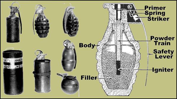
The grenade originated from the idea similar of a pomegranate. Besides the shape, if the fruit is overripe, it will explode. The grenade does the same thing. This object dates back to the Byzantine Empire and has been used in different countries and many wars. There are different outer shell designs of the grenade, but it the inside is designed similarly: the body, the filler, and the fuse. When the trigger is pulled, then the chemical is exposed and ready to detonate.
imagesource: grenadelauncher.com
Intended for military usage, grenades were hand held weapons easily thrown against the opponent. It is used during close combat wars for protective reasoning. There was countless of wars happening and everyone needed to defend him or herself, and grenades did the job. However, as grenades were being used in the Vietnam War, the newly design object did not explode. They did not work properly and they were left on the grounds in Southeast Asia for civilians to touch and blow up on them.
In military and survival defense, grenades are great objects to use to protect one’s country. The dangerousness of the grenade took away lives in the war and other non-deserving deaths. It was intended to great success, but it came with consequences. People should understand that grenades are used in life or death situations. There should be no fowl play because it can hurt someone. Society understands there are weapons that will hurt people, they just have to know when to use it and when not to. People may find it morally wrong, but there is no way of stopping the production of grenades. If people are willing to sing along to a song entitled, “Grenade”, think what else they might do.

Monday, November 15, 2010

You can stand under my umbrella. Eh Eh

Goodbye sun, hello rain! It's raining season in Davis, so grab your umbrella. (That is, if you own one). Umbrella vary from color, size, and sturdiness. Through Ergonomics research, inventors discuss 5 areas in order to produce a good quality product. Let's see if umbrellas pass the test.


image source: http://www.umbrellas.net

Safety first. Safety is very important in all product making. We don't want to buy something that will harm us in any way. Umbrellas are safe. However, if you use it for other things, it's quite dangerous. Umbrellas have sharp tips that might poke you or others and metal springs that clip your finger if you close it wrong. The safety precaution should be of others, rather that of one self. Umbrellas will hurt people if used improperly. Open it away from others. You don't want to point them in the eye. Other than that, it's safe.

Comfort and ease of use is next. People will buy objects when it is comfortable to one's self and one's lifestyle. Because there is one way to use this object, we wouldn't think it is uncomfortable. However, if you are trying to juggle coffee, books, cell phones, and the umbrella itself, it's very uncomfortable. You are only left with one hand to do things or else you will get soaked by the rain water. Then you will be uncomfortable using the object. You hands will be cold and you are more likely to drop things. It's easy to open the umbrella. The standard umbrellas have one simple button you hold and then you extend the shaft. Two simple steps. However, the ease of using it may not be simple if you need to walk in the rain.

image source: http://www.uniqueexposures.com
Performance and productivity may be the reason why umbrellas were invented. It serves one purpose, to protect one and cover from rain (sometimes sun). However, throughout the decades, the productivity level has been tweaked. You can use it as a cane, decoration, or props for dancing. But in the end, it is used to protect. Throughout cultural and countries, umbrellas have a universal meaning. The performance might fall short depending on what medium is used. When it is pouring rain, you will want to use an umbrella. Given. However, when there is rain and wind, the umbrella looses the battle. You are rarely protected from the rain and your back gets wet. The productivity value looses. Unless the umbrella is clear, you will not know where you are walking because you can trying to cover the front your face, which leaves the back open. It fails. Also, when it's windy, there is a high chance that your umbrella will prop open in an opposite direction which leaves you flying around to get it back to its normal shape before you get soaked. Again, if you loose the battle, you loose the umbrella. Money wasted.
click image to purchase

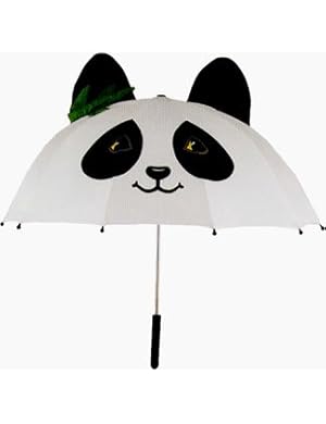
Lastly, we have aesthetics. From long and thin to short and small, umbrellas posses all sizes. They don't discriminate. There is a size for everyone depending on how one likes their umbrellas. Some like it tall and thin to accommodate more than oneself. Others like small ones for one and easy to stow away. There is one to match everyone's lifestyle. Designs also vary from panda's to polka dots to logos and different colors. Depending on if you like accessorizing with umbrellas, then you should purchase one. However, if you don't. you should pay someone to hold it for you.


You should consider the 5 ergonomic elements when purchasing an object. You don't want to have objects that are obsolete. With the 5 ergonomics research techniques, umbrellas has passed the test in good ways but fails in others. But make sure it will effective in your lifestyle. If umbrellas aren't your style, there are always raincoats, hats, jackets, or  newspapers.

Or you can take advice from Rihanna.
image source: http://ritaballou.blogspot.com


Designing Dance

Since living in Davis, CA I have been exposed with hip hop dancing. Personally, I can't dance like a pro but I still try. Having friends who are in various of dance teams on campus, Sacramento, and the Bay Area, I have become fairly familiar with the dance life. I constantly watch live performances and live performances on Youtube.

I would like to share Choreo Cookie's piece of "The Climb" performed at 2009 Culutre Shock. You might not consider this as design, but choreography utilizes design elements. This piece offers symmetry, asymmetry, balance, one point perspective, ease of movement, comfort, aesthetics, and many more.

Throughout the dance, people are dancing in different levels. Some are higher than others, others and lower. Some aren't moving while others are moving around them. Some are mirroring each other which creates an illusion of symmetry. Other's are moving at different times which creates an illusion of asymtry. The two distinct features make the dance strong and offers different persepctive.

While the dance offer different perceptive, there is a one point perspective. Example is in the beginning, the boy and the girl. With the help of one point perspective as well as the multi perspective, it tells the story and that is the concept.

Without the concept behind the moves and ease of movement, the concept would not make sense. There needed to be layout and change as the choreography developed. Criticism and "playing" is helpful. The moves had to be safe and easy to do because if it was difficult, no one could produce the movements. Everything would look sloppy.

The overall Gestalt look alludes to the overall aesthetic look. The whole concept with different elements make the piece strong. Every dancer needed to invest their part to make the piece look "pretty". Every move was well thought out and if they were not on time with the moves, it would look messy. Different levelings made it performance strong and the emotion invested in each dancer was evident.

Monday, November 8, 2010

Word and Image with Jay-Z Brooklyn (Go Hard)

In the video "Brooklyn (Go Hard)" by Jay-Z feat. Santa Gold, typography is used to illustrate a video. The video form is all text based as words are interacting as the beat is being made to later form an image.

Word and image is used very precisely in this video going along with the beat, rhythm, and pattern. Each letter is presented as each beat it made, which strengthens the whole image. Gestalt principles are also presented as you watch the video. It starts off with single unities (letters) and as the song progress, it becomes whole (picture of Jay Z then later of Biggie). Each sum of the parts are combined to create a whole, which keeps watchers guessing, why are only letters being shown? It makes more sense once the video ends.

Rather than using actual people and actual objects, the words and images that are created offers a different optical feel. The optical feel allows one to think ahead and think outside the box. It follows the spelling of the word Brooklyn throughout the whole song. The choice of word Brooklyn creates an image that represents Brooklyn so well, Jay Z and Notorious BIG (Biggie). They both are inspiration for native Brooklyns now and then. Light sheds through this video paying homage to the ever popular rappers. No bling, no sex, no diamonds are needed for this video. Only words that sketches out iconic rappers.

This video does justice to paying respect for the once loved rapper and the reigning rapper himself, Jay Z. Words and image have never been so powerful joining together for society to use their optics and haptics. Listeners are able to pay close attention to the typography which keeps the video flowing. Without typography this video would be bland.

Word and Image


Advertising is a important in the marketing world today. Without stand out designs of advertising material like posters, videos, fliers, or logos, products will not sell. Consumers in today's society like visual over words. Image trumps the idea of reading. But one cannot stand-alone. The power of image and word is at its best together, especially in advertising.

Let's take this Durex ad for example, designed by Andrej Krahne. (Click Image for more pictures)The main image is two people having sex, however to create that image they used words to shape the bodies. The intense amounts of words were used precisely to describe the sensations all over the body. This idea and concept catches consumer's eyes quickly. We live in a place where sex sells. And so does this ad. The creative use with words and image helps make the ad more effective that it would be if the bodies were of actual humans. 

Everything was put in place for a perspective. Especially the condom logo "Durex". They are selling their product. They are doing a great job using typography and graphics. The visuals are undeniably pleasing to the eye, despite that its two people having sex.